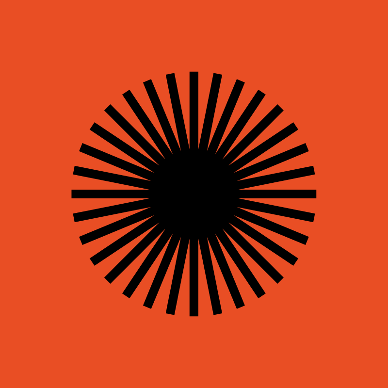
For 2020, the Sundance Film Festival employed Studio Lowrie to rebrand with these striking and op-art glyphs and typography based branding. Its simple and powerful, and stands out amid the visual noise of Park City during the festvial. As a system it uses a pared down color pallate and is meant to function across a variety of media and applications, and both static and in motion. It also takes cues from four musical pilars: Jazz, Rock, … Italo-Disco.
Looks almost a bit like navajo art or camera test and focus patterns. The Studio themselves mentions the circular shape is referential of film projectors, eyes dilating or contracting, and the sun.
Branding from Studio Lowrie
Typeface La Nord by Raoul Gottschling
Motion by Connor Campbell
More on It’s Nice That.

Sundance Motion Reel – Connor Campbell