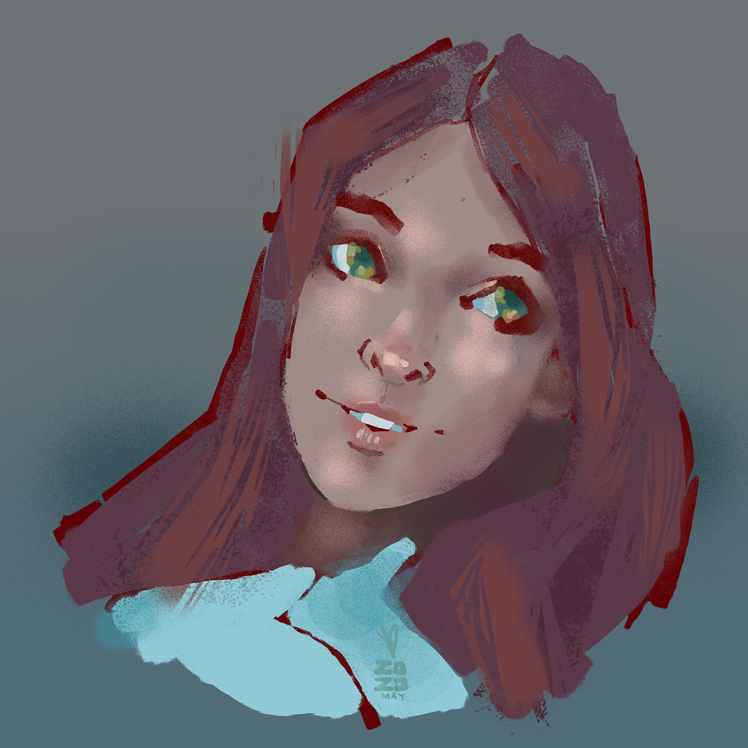
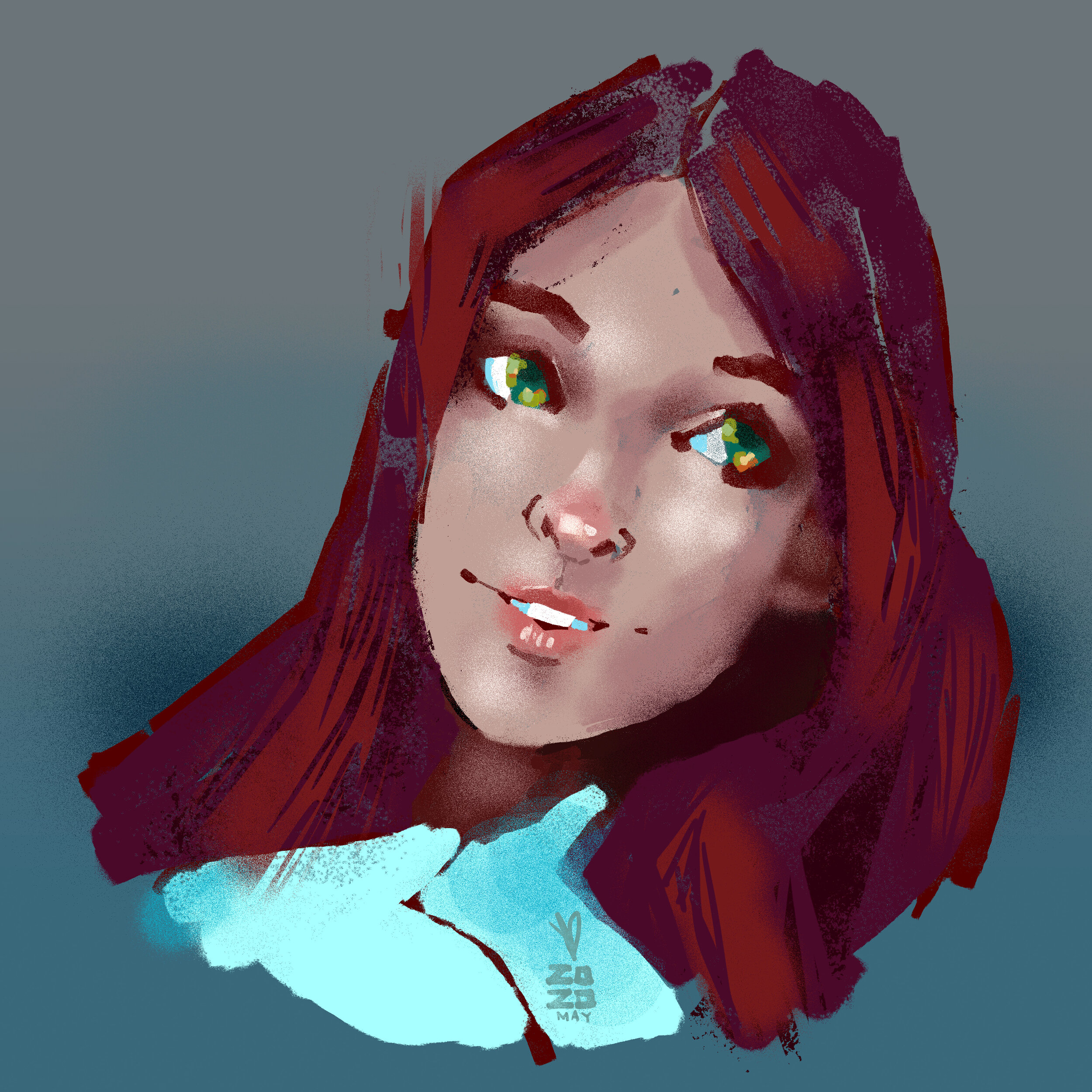
I have had a tendency in the last few years with regards to color in my digital painting and probably design work and I just had a revelation. I would paint, or grade photos a lot of the time with tuning the black point up so there is no 'true black' to the image. Also, I might do a sketch and tone the line work deep red or deep blue, and then paint over it to embed a little warmth into the image. Its a subtle thing but you make different choices with color painting over a colored sketch than a black and white one.
This all runs very contrary to the method I see from a lot of digital artists where they will sketch in black and white or grey, then do flat color selections, and do a shading render in black and white and eventually work color back into the image. I start with color and avoid being stark from the very beginning.
Ive also borrowed a technique from illustration school with drawing over a grey or toned background. where you are then pushing the image more and more toward the highlights and low lights, but the initial work is very low contrast. and in a lot of case its low saturation, though there is color.
I completed a drawing this morning and i threw a levels layer over the top of it and it occurred to me that Im painting in a way that is very much like shooting 'flat' for raw post processing. Where you shoot and things are very even and greyed out almost allowing the most information in each image and therefore the most flexibilty with the color grade after. I think somehow from years shooting photos and video, and painting and staring at computer screens, I might even have built up an affinity for this low contrast look. I can boost the colors but I almost prefer then neutral toned down version.
This style of using color is also very useful in that you can paint and paint and paint all very close to your limited palette, neutrals, and then suddenly when you add a bold color or a very dark or light color you immediately have a lot of contrast that can add focus to your image.

Painting Process from Ryan Lang

